Just a little bit of sewing, some more Stars and a couple of Crossroads which is the next block. I finished the last book I bought on holiday so I may get back into it now.

I have been to-ing and fro-ing with fabrics. Trying to decide on a background for my Jane P quilt. It's a matter of pinning to the wall and pinning the circle on top, taking a photo and taking it back down again and then pinning up the next and next again. I did leave the first one up for quite a few days but the others had a quick turn around. I still haven't made up my mind. They are all out of my stash. See what you think, they are all 1m [40"] of fabric, so it's large.

This one is used in the centre shapes.
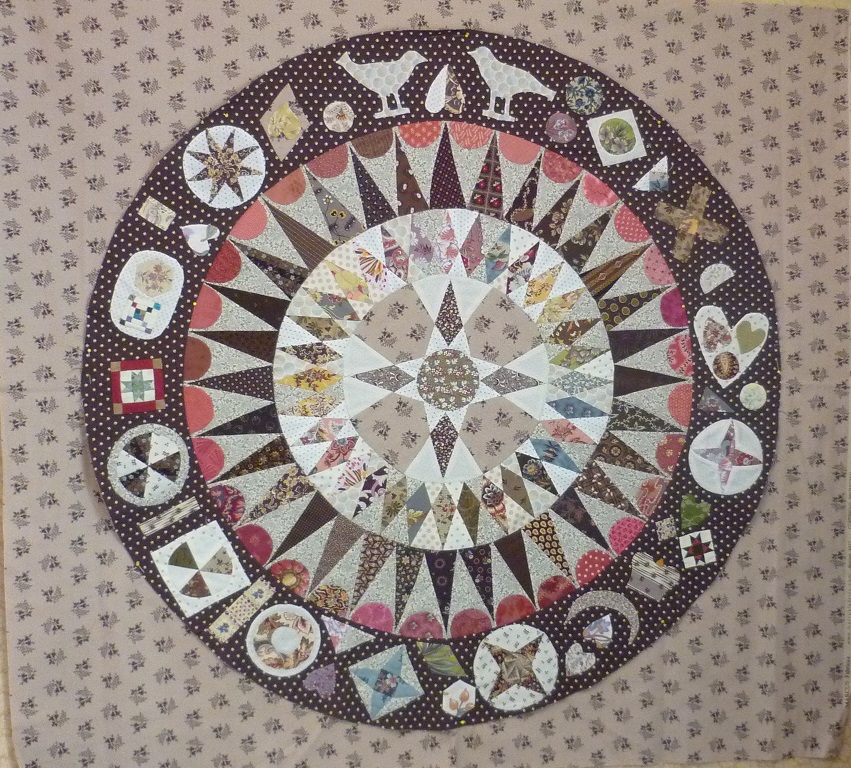

This is a red stripe, old Rocky Mountain range.

Hmm!

15 comments:
This is fun - to see all the different backgrounds on your JP. It is a beautiful centre by the way - just stunning! They are all lovely but I am drawn to the red - it echoes the red half circle border inside. I like the Rocky Mountain stripe too...
Hilda
I I agree with Hilda, it's very nice to see your options, and how much they can change the look of your beautiful centre medallion. I love red, so lean towards the last two options. But I also like the second one. I think the uniformity and smaller print supports the centre without detracting from the detail. Have fun choosing.
Well...since all five you've chosen are beautiful, I think you must make five versions of this! Haha! They really are all beautiful, but I must say I am partial to the red one, the fourth, the most. I love any of them though!
I think like the last two options in red. The red strip makes the medallion stand out, but the red in the last one makes all the details in the medallion stand out, it just looks more vibrant to me. It truly is lovely I can't wait to see which you pick.
Hi Dorothy, I like the first or the stripe best. And of course, your medallion is gorgeous.
Beautiful medallion! They all look great but I like the dark red floral best.
I like the second one, since it makes the circle stand out and gives it a nice contrast, but it might be too light? The third one is nice to, has just enough contrast but also blends together nicely without making it pop.
Debbie
I love your header quilt - it's beautiful and you did a wonderful job. I love the fabrics you used.
I think I'd pick the top background. In the pictures, at least, the circle stands out more on it.
I just love the red, it makes the block and all the work you have done so far just pop so much. I am sure whatever you decide it will work.....
Kathie
How lovely to see all the options! It's what we all struggle with, trying to find the perfect background that suits us and what we're doing. Your medallion is fabulous! Always a pleasure to come see what you're working on.
If you are looking for opinions - I like the red, a lot!
My, my so hard to choose, I like the Rocky Mountain stripe and the second pic. I wonder which one you will choose?
The circle piece is wonderful. I like the most outer ring the most. I am drawn to the fabric in the first photo but looks like I might be the only one thus far. I think it is a little boring on the second fabric. The red is a good choice too but I am wondering what comes after before I would choose that one.
What a gorgeous block! I really like the red background.
Hi Mum, I like the fabrics that don't look too separate from the circle, 1st or 3rd. :-)
Post a Comment